It’s a fraught business rolling out new sports branding
Before the revamped Cavalier and V-sabres, there was
On a muggy September night in 1983, in the football season opener against Duke, an ice storm of scorn pelted the newest member of the UVA athletics department: a portly, snout-nosed creature known as “The ’Hoo.”
Children liked him. Students decidedly did not, raining insults and ice cubes on his head with equal vehemence, and laudable aim. More disturbingly, Sports Illustrated reported that The ’Hoo also “suffered the forced removal of his tongue by pie-eyed fraternity boys.”
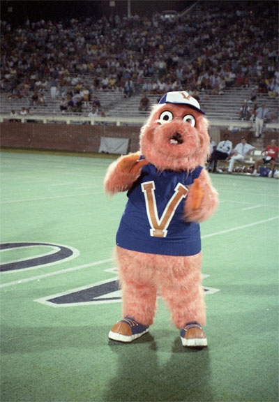
Surgically repaired and admirably undeterred, The ’Hoo returned the following week against Navy. But, concerned for the safety of the student inside, the athletics department “quickly put it back in the box,” says Todd Turner, UVA’s sports marketing director at the time.
Rolling out new mascots and logos is always a fraught business. They are symbols of pride and tradition, emblems of everything a university stands for—or at least what it believes looks cool on a T-shirt.
That was demonstrated again this spring, in a logo imbroglio in which the athletics department drew heavy flak.
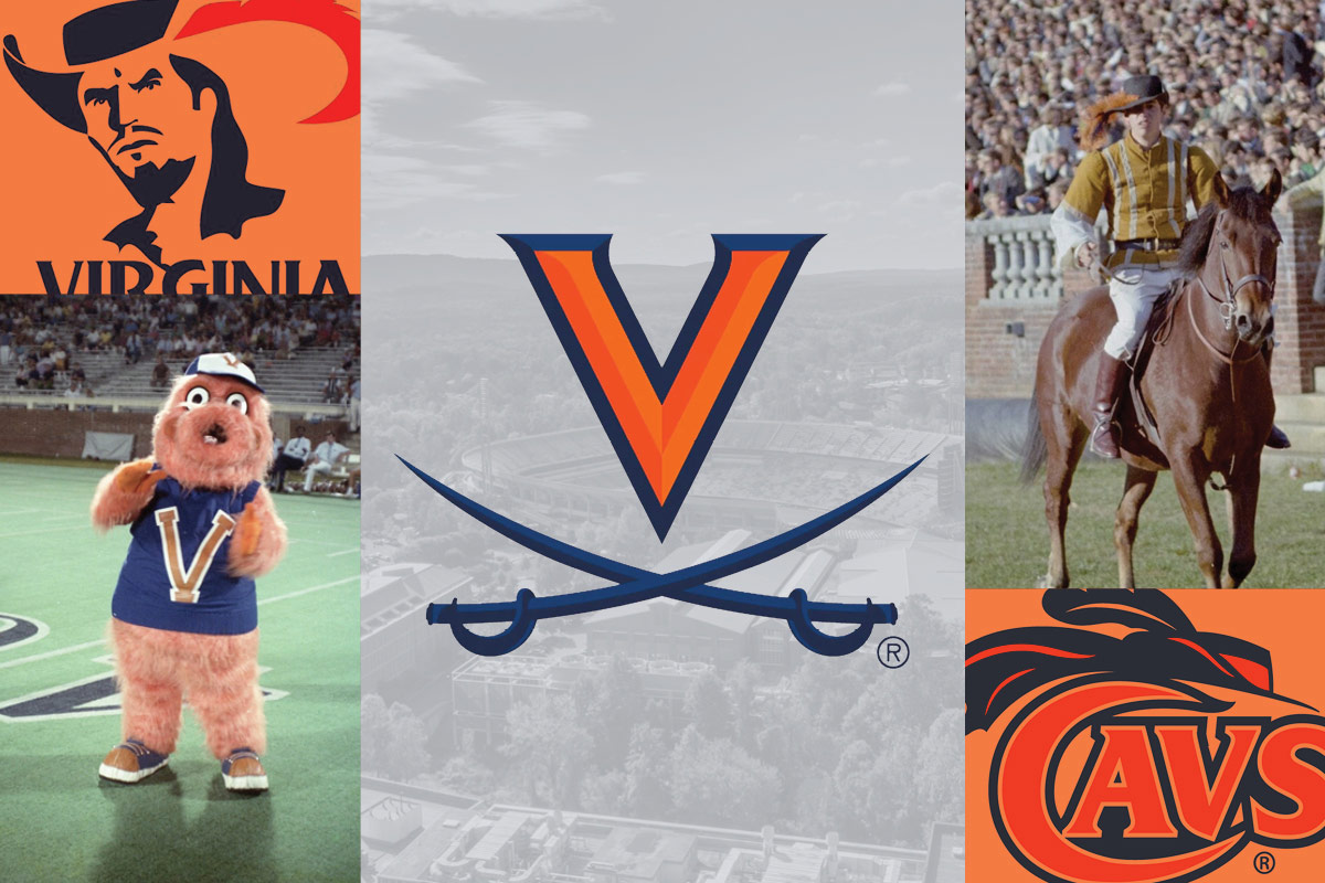
To recap: In April, the athletics department unveiled a redesign of UVA’s iconic V-Sabre, along with two new secondary marks: a Cavalier shield and a faceless Cavalier intended to be more inclusive.
By June, the department was forced to punt, and apologize for, a design detail intended to pay homage to the Academical Village’s famous serpentine walls. Those one-brick-thick architectural wonders have taken on a controversial symbolism since a 2018 report by the President’s Commission on Slavery and the University, which posited that the walls, originally taller than now, were meant to conceal the enslaved laborers within the work yards behind the Pavilions, today’s gardens.
In announcing the change, Athletics Director Carla Williams said she was unaware of the history of the walls. So, apparently, was Nike, which led the redesign, an 18-month project in which input was sought from coaches, student-athletes and staff, the company says. Williams said the logos would be redesigned to remove the serpentine wall detail, which was included on the handles on the swords of the V-Sabre and Cavalier Shield logos.
“There was no intent to cause harm, but we did, and for that I apologize to those who bear the pain of slavery in our history,” she said.
Mixed reaction from the start
The change was announced nearly two months after the logos were revealed—garnering some negative feedback from alumni.
Why redesign in the first place, particularly coming off a year in which UVA’s athletics received so much exposure, with a national championship in men’s basketball and a division title in football?
It was the first update in 20 years, and an attempt to liven up the logos for the digital age by making them “bold, creative, innovative and competitive,” Williams said when announcing the rollout.
Much of the initial criticism focused on the design of the secondary images, which feature a downcast Cavalier, face hidden beneath a hat, sabre-wielding arms crossed in front.
The idea is that the Cavalier could be anyone, not the white male of previous depictions. But where some see a symbol of inclusion, others see submission in that downward-facing pose. And—of all the blasphemies!—they see Carolina Blue in the accent color on the Cavalier’s hat.
That assumes they can make out what they are seeing at all. The overhead vantage point can make it difficult to discern at first.
“When I first looked at it, I thought, ‘What is this thing?’” said Joel Rubin (Col class of ’75), a public relations executive from Virginia Beach.
Another secondary mark, the Cavalier Shield, features the hat alone, mounted on a plaque, with sabres beneath. Is that a modern take on a coat of arms? Or an opponent’s mounted trophy?
As is often the case on social media, detractors pulled no punches, calling the images cartoonish, muddled, overly complicated, even “beetle-like.”
“Wow, these new marks are awful,” Sean Lauer (Com class of ’04, Darden class of ’13), a marketing executive in San Francisco, wrote on Twitter. “Please do not use them anywhere near the iconic V-Sabre. What a waste of time and money. Embarrassed alum over here.”
Washington Nationals pitcher Sean Doolittle (Col class of ’08) was more diplomatic. While he conceded that the secondary logos “might take some getting used to” he said he “really liked” the new Cavalier and referred to the Cavalier Shield as “pretty cool.”
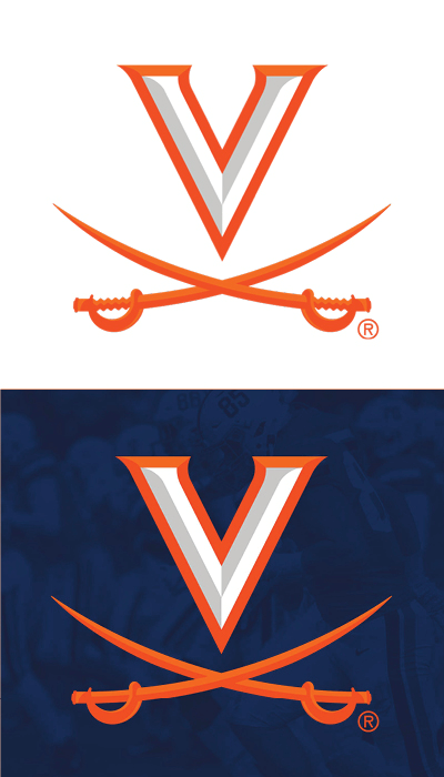
Tweaked, rather than reimagined, the V-Sabre at first got off lightly. But in muscling up the mark to make it bolder in the digital age, designers added those serpentine grips to the sabres.
Student Lauren Cochran (Col class of ’22) told the Cavalier Daily, “As an African-American student who walks past these walls every day, I experience uncomfortable emotions relating to the history and justification of the walls.”
Media studies professor Meredith Clark also criticized the design.
“There are ways to promote UVA, to develop stellar branding, and to honor/acknowledge the history of this place that don’t include integrating ahistorical depictions of these Grounds. It’s not too late to fix this,” Clark wrote on Twitter.
A long evolution
In simpler times, before the advent of sports marketing, logos and mascots evolved organically, without the assistance of global companies like Nike, which are in the business of selling merchandise.
The nickname “Cavaliers” arose from “The Cavalier Song,” which was the winner of a 1923 contest by the student newspaper, College Topics, to choose an alma mater and fight song.
A beloved canine named Beta served as an unofficial mascot in the 1930s. He was reportedly once left in Athens, Georgia, after a football game, only to scratch at the back door of the Beta House two weeks later. He died in 1939 after being struck by a car.
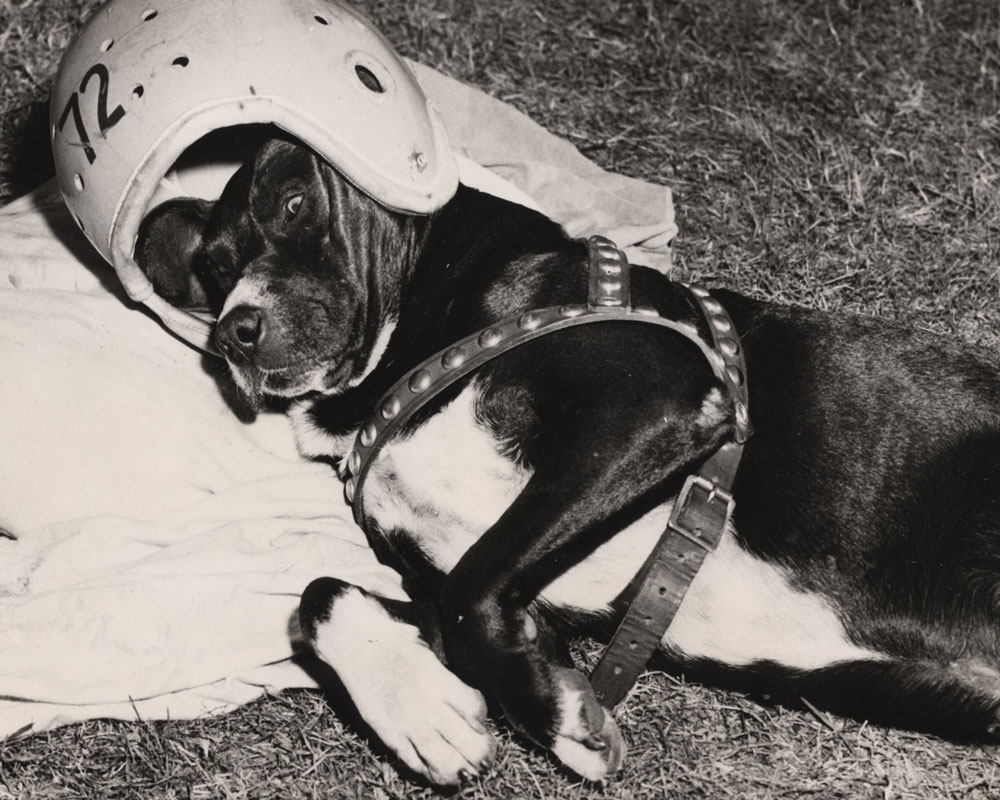
Another dog, a cross-eyed mongrel named Seal for his slick, black fur, came along in the 1940s and surpassed Beta in legend and deed with one memorable lift of his leg. It happened in 1949, in front of 80,000 spectators in a game against Penn at Philadelphia’s Franklin Field.
According to the Cavalier Daily, Seal strolled to the Penn sideline and appraised the “cheerleading appurtenances” of the Quaker squad before “coolly, insolently” marking them as his own.
Thus inspired, the Cavaliers won, 26-14.
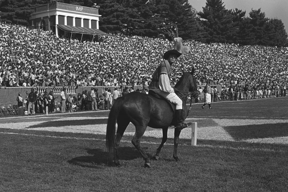
In 1963, a horseback rider in Cavalier garb became the mascot. Sports marketing was still in its infancy when Turner took the job in the early 1980s. With no formal training, he flew by the seat of his khakis.
“We did crazy things,” he says. “We wrote and cut jingles. [Longtime radio voice] Mac McDonald and I even sang on one of them.”
The ’Hoo, which bore a resemblance to the Phillie Phanatic that bordered on plagiaristic, was one of his crazier inventions.
Logos were also a mixed bag in those days. A package of marks that included the word “Cavs” with a hat perched on the “C” was commissioned but quietly abandoned. Also in the jettisoned package was a tiny, charging Cavalier and a Cavalier on a rearing horse emerging from a University seal.
The stern “serious Cavalier” served as the department logo from 1984 to 1994. It gave way to the “Split-V” logo in 1995.
History of the V-Sabre
None were as popular or enduring as the V-Sabre, which was designed as a helmet adornment by Matt Welsh (Col class of ’94), son of football coach George Welsh, for the 1994 season.
“The whole uniform was redesigned, and that was the centerpiece of it,” he says. “It was done quietly, because both my father and I knew that if it was run through channels, especially if it was me that was doing it, even for free, it would have never seen the light of day.”
In his research, Welsh found that there had been little consistency in the University’s depiction of cavaliers over the years. Most seemed to be loosely based on English Civil War cavaliers, who were known to carry sabres, though with straight blades. Using that as a starting point, and taking additional inspiration from the U.S. Army’s Cavalry symbol of two inverted and sheathed sabres crossed, he got to work.
After much trial and error, he settled on a white “V” with an orange outline, above curved orange sabres on a blue helmet.
Fans liked the new look. By 2005, the athletics department adopted the V-Sabre as its official logo. Welsh says he never made a dime.
Almost immediately, the logo began being misapplied, Welsh says. Though he never intended it to be removed from the helmet, it showed up all over, often without consideration of how it would look against lighter backgrounds.
“On the basketball court, that’s all wrong,” he says. “That’s a light background, and it should be an orange ‘V’ with a blue outline and blue sabres. It just disappears.”
In announcing the enhancements to the V-Sabre in April, Williams said the logo often looked “washed out” next to those of other schools.
Usually, the problem was a simple failure to reverse the colors, Welsh says.
The day the new V-Sabre logo was unveiled, Welsh says his phone “blew up.” To him, the beveled “V” and thicker sabres looked like one of his early sketches on the way to his final design: top-heavy and not “visually stable.”
“I’m as biased as I could be, but I think they made it worse,” he says.
The V-Sabre remains the department’s primary mark. How widespread the secondary marks will become is unclear. They’re intended to be complementary “detail graphics” on uniforms, social media and apparel.
But how have they appealed to fans?
Mark Mincer (Com class of ’85), whose family has sold UVA gear for generations at its namesake stores, said the coronavirus pandemic made it difficult to gauge the popularity of the new items. He says the secondary marks might appeal to younger buyers.
Perhaps, but if an unscientific sampling of students on a May afternoon on The Corner is an indication, the secondary marks could possibly fade.
“It’s weird-looking to me because there’s not a face,” says Selma Raphael (Nurs class of ’20), while sizing up a T-shirt with the Cavalier logo displayed in a store window. “It’s almost, like, creepy-looking. I’ll still buy the old stuff.”
As for The ’Hoo, after being pulled from the Navy game, it made just one more appearance, at Turner’s going-away party when he left for the University of Connecticut in 1987.
Ironic though it might have been, The ’Hoo finally got his ovation.